

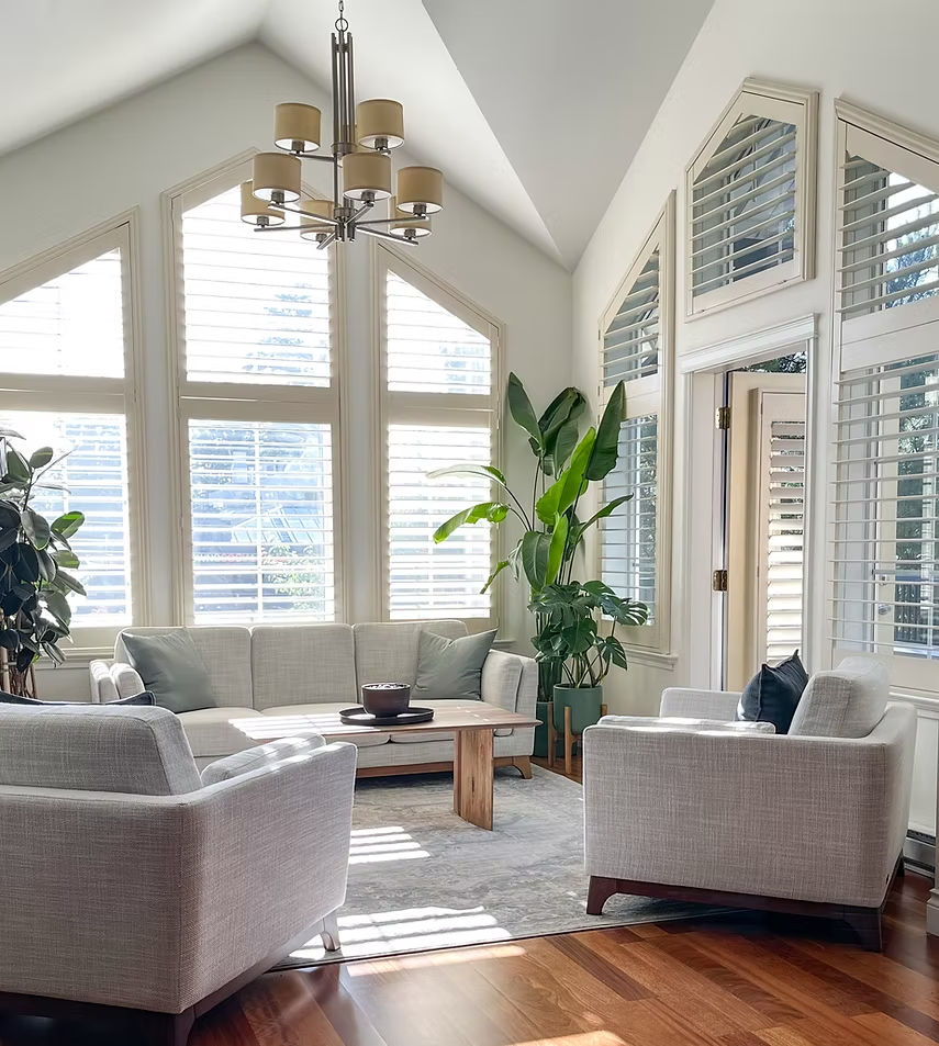
Older homes in Manotick have something that can be difficult to reproduce in a new build: character. Mature neighborhoods, distinctive architectural details, traditional floor plans, wood trim, fireplaces, built-in cabinetry, and unique craftsmanship can give an established home a sense of warmth and personality.
However, an older home can also begin to feel dated when its interior paint colors no longer complement the way people live and decorate today. Dark beige walls, yellowed whites, cool grey palettes, overly bold feature walls, and colors selected decades ago can make otherwise beautiful rooms feel smaller, darker, or disconnected.
Modernizing an older Manotick home does not necessarily require removing the features that give it character. In many cases, professional interior painting can create a dramatic transformation while preserving the home’s original personality.
The key is choosing colors strategically.
The right interior paint palette can brighten rooms, connect older and newer finishes, emphasize architectural details, complement wood and stone, and create better visual flow throughout the home. Professional preparation is equally important because older walls, ceilings, doors, and trim may require more attention before new paint is applied.
Low Mountain Painting provides professional interior painting services throughout Manotick, Greely, Barrhaven, Kanata, Stittsville, Riverside South, and surrounding Ottawa communities, helping homeowners create updated interiors that feel fresh without losing the qualities that make their homes distinctive.
Modernizing Does Not Mean Removing Character
One of the biggest mistakes homeowners can make when updating an older property is assuming everything traditional needs to disappear.
A successful renovation often does the opposite.
Instead of fighting the home’s architecture, thoughtful paint choices can highlight it.
Original features such as:
- Wood trim
- Crown moulding
- Built-in shelving
- Fireplace surrounds
- Interior doors
- Wainscoting
- Ceiling details
- Staircases
can become design strengths when surrounded by a more contemporary color palette.
The objective is not necessarily to make an older Manotick home look like a brand-new subdivision home. It is to create a current, comfortable interior that respects the home’s existing character.
Start With the Existing Materials
Before choosing paint colors, homeowners should identify the permanent finishes already inside the home.
These may include:
- Hardwood flooring
- Stone fireplaces
- Kitchen countertops
- Cabinetry
- Tile
- Wood trim
- Brick
- Staircases
These materials contain undertones that influence which paint colors will work successfully.
For example, warm hardwood flooring may clash with an extremely cool grey wall. A warm greige, soft cream, or muted earthy neutral may create much better visual harmony.
Paint should connect the existing materials rather than compete with them.
Replace Yellowed Whites With Fresh Warm Whites
White paint changes significantly depending on its undertone.
Older homes sometimes contain whites that have become noticeably yellow or were originally selected with strong cream undertones.
Updating these surfaces with a cleaner warm white can immediately make the interior feel fresher.
Warm whites work beautifully with:
- Hardwood flooring
- Natural stone
- Traditional millwork
- Wood furniture
- Brass fixtures
- Contemporary black accents
They provide brightness without creating the stark appearance that some cooler whites can produce.
Why Warm White Works Particularly Well in Manotick Homes
Many established homes contain materials with naturally warm characteristics.
Examples include:
- Oak
- Maple
- Brick
- Natural stone
- Warm tile
A slightly warm white can complement these features while making the surrounding room feel brighter and more contemporary.
This is particularly effective in:
- Entryways
- Hallways
- Living rooms
- Kitchens
- Open transitional spaces
Move Beyond the Cool Grey Era
Grey became one of the dominant interior colors for many years.
While grey itself is not necessarily outdated, homeowners are increasingly moving away from extremely cool blue-grey interiors.
Warmer neutrals can create a softer, more inviting appearance.
Popular alternatives include:
- Greige
- Mushroom
- Taupe
- Warm beige
- Creamy off-white
- Soft clay-inspired neutrals
These colors provide the versatility homeowners appreciate in neutrals while introducing greater warmth.
Greige Can Bridge Traditional and Contemporary Design
Greige is particularly useful when modernizing an older home.
It combines the neutrality of grey with the warmth of beige.
That makes it compatible with both traditional and contemporary materials.
Light greige can work with:
- Existing hardwood
- White trim
- Stone
- Black fixtures
- Modern furniture
- Traditional cabinetry
For homeowners who want an updated appearance without committing to white walls throughout the house, greige can be an excellent alternative.
Consider Soft Taupe for Sophisticated Interiors
Taupe can add depth without making rooms feel excessively dark.
It works particularly well in:
- Dining rooms
- Primary bedrooms
- Formal living spaces
- Home offices
Paired with warm white trim, taupe can create a sophisticated transitional style that feels current while remaining appropriate for an established home.
Sage Green Can Modernize Without Feeling Trendy
Nature-inspired colors continue to work beautifully in residential interiors.
Muted sage green is particularly effective because it introduces color without overwhelming a room.
It can complement:
- Natural wood
- Warm whites
- Stone
- Neutral upholstery
- Black accents
Sage can work especially well in Manotick homes surrounded by mature landscaping and natural scenery.
Consider it for:
- Home offices
- Bedrooms
- Dining rooms
- Mudrooms
- Built-in cabinetry
Muted Blues Can Refresh Traditional Spaces
Soft blues can introduce personality while maintaining a timeless appearance.
Instead of bright or highly saturated blue, homeowners can consider:
- Dusty blue
- Blue-grey
- Muted slate blue
- Soft coastal-inspired blue
These shades can work beautifully in bedrooms, bathrooms, offices, and selected living spaces.
Don’t Be Afraid of Dark Colors
Modernizing an older home does not mean making every room light.
Dark colors can actually emphasize traditional architectural details.
Rich colors such as:
- Deep navy
- Charcoal
- Forest green
- Deep olive
- Chocolate brown
can create sophisticated spaces when used intentionally.
They may work particularly well in:
- Libraries
- Offices
- Dining rooms
- Powder rooms
- Fireplace walls
The key is balancing darker colors with appropriate lighting, trim, flooring, and furniture.
Modernize the Living Room With a Cohesive Neutral
Living rooms often contain several important design elements at once.
These might include:
- Fireplace
- Hardwood
- Large windows
- Built-in cabinetry
- Traditional trim
A restrained neutral wall color can allow those architectural elements to become the focus.
Warm white, light greige, or soft taupe can provide a modern backdrop without stripping the room of personality.
Use Paint to Highlight the Fireplace
Fireplaces frequently become focal points in older Manotick homes.
Instead of competing with the fireplace, wall color should complement its material.
For a natural stone fireplace, homeowners might consider:
- Warm white
- Greige
- Taupe
- Muted green
For traditional brick, the correct choice depends heavily on the brick’s undertones.
The goal is visual harmony rather than forcing the fireplace into an unrelated palette.
Modernizing an Older Kitchen With Paint
A complete kitchen renovation can be expensive.
Paint can sometimes deliver a significant visual update without replacing major components.
Homeowners can consider updating:
- Walls
- Ceilings
- Trim
- Doors
- Paintable cabinetry where appropriate
A dated kitchen surrounded by yellow-beige walls may feel dramatically different after introducing a carefully selected warm neutral.
Cabinet Color Can Transform the Kitchen
Where cabinets are structurally sound and appropriate for refinishing, professional cabinet painting can provide another option.
Popular contemporary cabinet colors include:
- Warm white
- Cream
- Greige
- Taupe
- Sage green
- Deep navy for islands
Cabinet refinishing requires specialized preparation and coatings. It should not be approached exactly like ordinary wall painting.
Coordinate Paint With Countertops
Countertops are usually expensive to replace, so they should influence the paint palette.
Look closely at the undertones in:
- Granite
- Quartz
- Marble
- Laminate
A countertop containing warm beige and brown tones may work beautifully with creamy white or greige walls.
Pairing it with a strongly blue-based grey could instead make both surfaces appear disconnected.
Update the Dining Room Without Losing Formality
Older homes often have dedicated dining rooms.
Rather than removing the room’s traditional character, paint can make it feel intentional again.
Consider:
- Soft taupe
- Muted green
- Warm greige
- Deep blue
- Warm white
Crown moulding or wainscoting can then be highlighted using coordinated colors and finishes.
Give Traditional Trim a Fresh Perspective
Trim can dramatically influence whether an older home feels dated or intentionally classic.
Homeowners generally have several options.
Refresh It
Repainting existing trim in a clean warm white can instantly brighten the interior.
Preserve It
Quality natural wood trim can remain an important design feature. Wall colors can be selected to complement rather than conceal it.
Reduce Contrast
Painting walls and trim in closely related colors can create a more contemporary, seamless appearance.
The correct approach depends on the quality and character of the original woodwork.
Don’t Automatically Paint Beautiful Natural Wood
Older Manotick homes may contain high-quality woodwork that would be expensive to reproduce.
Before painting original wood trim, doors, or built-ins, homeowners should consider whether preserving them would add more character and long-term appeal.
Modernization does not require turning every wood surface white.
Sometimes changing the wall color is enough to make traditional woodwork feel current again.
Paint Interior Doors for a Bigger Transformation
Interior doors occupy more visual space than homeowners sometimes realize.
Freshly painted doors can make hallways and rooms feel substantially cleaner.
Traditional white remains popular, but certain homes can also support:
- Warm off-white
- Greige
- Charcoal
- Muted taupe
Using darker doors selectively can introduce a sophisticated architectural element.
Update Hallways to Improve Whole-Home Flow
Hallways connect nearly every major room.
If the hallway color is outdated, the entire home can feel fragmented.
A light, versatile neutral can create a visual bridge between spaces.
Good options may include:
- Warm white
- Light greige
- Pale taupe
- Soft beige
This provides flexibility for more personalized colors inside individual rooms.
Modernizing the Staircase Area
Staircases are prominent architectural features in many established homes.
Professional painting can refresh:
- Stairwell walls
- Trim
- Railings
- Newel posts
- Risers where appropriate
A coordinated staircase can dramatically improve the first impression of the interior.
Use Paint to Make Smaller Rooms Feel Larger
Some older homes have more divided floor plans than newer open-concept properties.
Painting can help smaller rooms feel brighter and more connected.
Strategies include:
- Lighter wall colors
- Coordinated trim
- Bright ceilings
- Reduced contrast
- Consistent hallway colors
These techniques can visually open a room without structural renovations.
Modernizing Bedrooms
Bedrooms are ideal places to introduce softer colors.
Popular options include:
- Muted blue
- Sage green
- Warm greige
- Soft taupe
- Warm white
The goal should be creating a restful space rather than simply following a trend.
Give the Primary Bedroom More Depth
The primary bedroom can support slightly richer colors than many common areas.
A deeper neutral or muted natural shade can make the room feel sophisticated.
Consider:
- Mushroom taupe
- Muted olive
- Dusty blue
- Warm charcoal
- Deep greige
Furniture, flooring, window treatments, and natural light should guide the final selection.
Modernizing Bathrooms With Paint
Bathrooms can quickly reveal the age of a home’s color palette.
If replacing tile or fixtures isn’t necessary, fresh paint can help connect older finishes to newer décor.
Wall colors may include:
- Warm white
- Pale greige
- Muted green
- Soft blue
- Light taupe
Bathrooms also require products appropriate for humidity and routine cleaning.
Home Offices Can Carry More Personality
Home offices provide an opportunity to move beyond standard neutrals.
Muted green, deep blue, warm taupe, and sophisticated darker colors can create a focused environment.
For a traditional Manotick home with built-in shelving, painting or coordinating the shelving can further transform the room.
Ceilings Are Part of the Design
Old ceiling paint can make a freshly painted room look unfinished.
Ceilings may show:
- Yellowing
- Previous repairs
- Inconsistent touch-ups
- General aging
Refreshing the ceiling can make the entire room appear cleaner and brighter.
Flat ceiling paint remains common because its low sheen helps minimize the appearance of surface irregularities.
Consider Color Drenching in the Right Room
Color drenching involves using the same or closely related color across walls, trim, doors, and sometimes ceilings.
In the right older home, this technique can make traditional architectural details feel surprisingly contemporary.
It can work particularly well in:
- Offices
- Libraries
- Dining rooms
- Powder rooms
Because it is a stronger design decision, lighting and room proportions should be considered carefully.
Accent Walls Should Have a Purpose
Accent walls can still work, but they should be intentional.
Instead of selecting a random wall simply because it is available, use color to emphasize an actual architectural focal point.
Examples include:
- Fireplace walls
- Built-in cabinetry
- Bed walls
- Dining room features
In some homes, painting the entire room in a cohesive color will produce a more sophisticated result than a single high-contrast wall.
How Lighting Changes Interior Paint Colors
Paint should never be selected without considering lighting.
Natural light changes throughout the day, and artificial lighting can significantly alter undertones after sunset.
A paint color may appear:
- Warmer in one room
- Cooler in another
- Darker in a north-facing space
- Brighter beside large windows
Testing samples inside the actual home helps prevent expensive color mistakes.
Test Paint Colors Beside Permanent Finishes
Samples should be evaluated next to:
- Flooring
- Cabinets
- Countertops
- Fireplace materials
- Trim
- Tile
A color does not need to look attractive by itself. It needs to look attractive inside that specific home.
This distinction is crucial when modernizing older properties with multiple existing finishes.
Why Surface Preparation Is Especially Important in Older Homes
Older homes can present painting challenges that newer properties may not.
Walls and ceilings may contain:
- Previous repairs
- Nail holes
- Cracks
- Uneven texture
- Multiple layers of paint
- Old caulking
- Damaged drywall or plaster
Simply applying new paint will not correct these problems.
Professional preparation may include:
- Cleaning
- Filling
- Sanding
- Repairing
- Caulking where appropriate
- Spot priming
- Full priming when required
Preparation often determines whether the final result looks like a simple repaint or a genuine transformation.
Choosing the Right Paint Finish
Modernization also depends on sheen.
Different surfaces require different performance characteristics.
Ceilings
Flat finishes are commonly used.
Living Areas
Matte or eggshell may provide an attractive balance.
Busy Hallways
Washable eggshell or satin can provide additional durability.
Kitchens and Bathrooms
Durable, moisture-appropriate coatings should be considered.
Trim and Doors
Satin or semi-gloss can provide durability and definition.
The exact product should be selected according to the surface and manufacturer’s specifications.
Low-VOC Paint for Interior Renovations
Homeowners renovating occupied spaces may also consider low-VOC paint.
Modern low-VOC products are available in a wide range of colors and finishes and can help reduce emissions associated with painting.
They can be particularly appealing for:
- Bedrooms
- Nurseries
- Family rooms
- Offices
- Whole-home repaints
Create a Whole-Home Color Strategy
One of the best ways to modernize an older home is to stop thinking about each room independently.
Instead, develop a coordinated palette.
For example:
Main neutral: warm white
Secondary neutral: light greige
Natural accent: muted sage
Deep accent: charcoal or navy
Trim: coordinated warm white
Individual rooms can still have personality, but shared undertones create continuity.
Avoid Making Every Room a Different Color
Older homes already tend to have stronger physical divisions between rooms.
Using unrelated colors in every space can exaggerate that fragmentation.
A cohesive palette helps rooms feel connected even when walls and doorways separate them.
This is one of the simplest ways to give a traditional floor plan a more contemporary feel.
Don’t Chase Every Interior Design Trend
Paint is easier to change than flooring or cabinetry, but whole-home painting still represents an investment.
Homeowners should prioritize colors that:
- Complement existing architecture
- Work with permanent finishes
- Suit personal preferences
- Provide flexibility for furniture
- Remain appealing beyond one season
Trends can provide inspiration, but the home itself should guide the final palette.
Painting Before Selling an Older Manotick Home
Professional painting can also be valuable when preparing a home for market.
Potential buyers may struggle to see beyond highly personalized or dated colors.
A coordinated neutral palette can help buyers focus on:
- Room size
- Natural light
- Architecture
- Flooring
- Fireplace features
- Overall condition
Fresh paint can also communicate that the home has been carefully maintained.
Modern Doesn’t Have to Mean Cold
One of the most important changes in interior design is the move toward warmer modern spaces.
A contemporary home can still feel:
- Comfortable
- Inviting
- Natural
- Personal
Warm whites, greige, taupe, muted greens, and carefully selected deeper tones can modernize an older home without creating a sterile appearance.
Common Color Mistakes When Updating Older Homes
Choosing Stark White Without Considering Undertones
A very cool white may clash with warm flooring or stone.
Painting Original Wood Automatically
Some woodwork is worth preserving.
Using Cool Grey Everywhere
Cool grey may emphasize the age of warm permanent finishes rather than modernizing them.
Ignoring Lighting
A beautiful showroom color may look completely different inside the home.
Choosing Each Room Separately
Without a whole-home plan, colors can become disconnected.
Forgetting Ceilings and Trim
Fresh walls beside yellowed trim or ceilings can make those older surfaces even more noticeable.
When Professional Interior Painting Makes the Biggest Difference
Professional painting can be especially valuable when homeowners want to:
- Modernize before moving in
- Prepare for resale
- Refresh an older renovation
- Coordinate mismatched rooms
- Update traditional color schemes
- Repair worn surfaces
- Brighten dark spaces
- Highlight original architecture
The transformation often extends far beyond the paint itself because a well-designed palette changes how flooring, furniture, cabinetry, and architectural details are perceived.
Why Professional Painting Matters in an Older Home
Older properties often require more preparation and planning than new construction.
Professional painters can assess:
- Wall condition
- Previous coatings
- Repairs
- Trim
- Surface compatibility
- Room lighting
- Appropriate paint products and finishes
They can then create a consistent finish across rooms that may have been renovated at different times.
Low Mountain Painting provides professional interior painting services throughout Manotick, Greely, Barrhaven, Kanata, Stittsville, Riverside South, and surrounding Ottawa communities, helping homeowners update established properties while preserving the features that make them unique.
Conclusion
Modernizing an older Manotick home does not require eliminating its history or replacing every traditional feature. Some of the most successful transformations happen when homeowners preserve the character they already have and use carefully selected interior paint colors to bring everything together.
Warm whites can brighten traditional interiors. Greige and taupe can connect older materials with contemporary furnishings. Muted greens and blues can introduce personality, while deeper colors can highlight fireplaces, built-ins, dining rooms, and offices.
Equally important are the details surrounding color selection. Natural light, flooring, cabinetry, countertops, trim, doors, ceilings, and architectural features all influence how a paint color will perform.
Professional preparation then turns that color strategy into a polished result.
For homeowners in Manotick and Ottawa’s surrounding communities, professional interior painting offers a practical way to create a home that feels brighter, more cohesive, and more current while preserving the craftsmanship and personality that made the property special in the first place.
Frequently Asked Questions
What are the best paint colors for modernizing an older Manotick home?
Warm whites, light greige, soft taupe, muted sage, earthy neutrals, and carefully selected blues can work particularly well. The ideal choice depends on the home’s existing flooring, woodwork, stone, cabinetry, and lighting.
Should older wood trim be painted white?
Not automatically. High-quality original wood can add significant character. In some homes, changing the wall color while preserving natural wood creates a more distinctive and sophisticated result.
Are grey walls outdated?
Grey is not inherently outdated, but very cool grey palettes may not complement the warm wood, brick, and stone commonly found in established homes. Warmer greige and taupe tones can sometimes integrate more naturally.
What color makes an older home feel brighter?
Warm white, cream, light greige, and other pale neutrals can increase perceived brightness, particularly when coordinated with fresh ceilings and trim.
Can dark colors work in an older home?
Absolutely. Navy, forest green, charcoal, deep olive, and rich brown can emphasize traditional architectural details when used thoughtfully.
Should every room in an older home be painted the same color?
No. A coordinated palette is usually more important than using one color everywhere. Selecting several colors with compatible undertones can create continuity while allowing individual rooms to have personality.
Should ceilings be repainted during an interior renovation?
Often, yes. Older ceilings can become yellowed or show previous repairs. Fresh ceiling paint can significantly improve the brightness and finished appearance of a room.
Can professional painting modernize a kitchen without a complete renovation?
Yes. Updating walls, ceilings, trim, doors, and suitable paintable cabinetry can substantially change how a kitchen looks without replacing every major component.
What paint finish works best in an older home?
It depends on the room and surface. Flat is commonly used on ceilings, matte or eggshell on many living-area walls, washable eggshell or satin in higher-traffic areas, and satin or semi-gloss on trim and doors.
Why hire professional interior painters for an older Manotick home?
Older homes often require additional surface repair, preparation, product selection, and color coordination. Professional painting helps address those issues while delivering consistent finishes that modernize the home without unnecessarily removing its original character.
