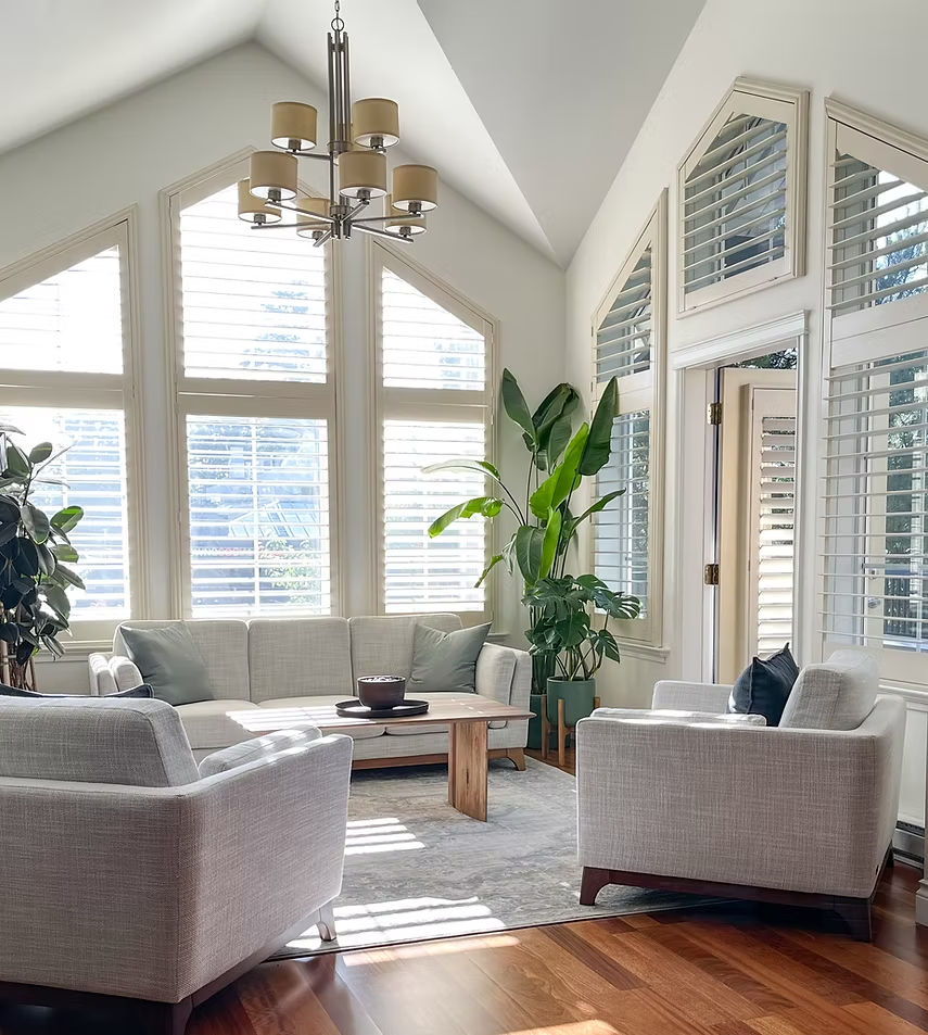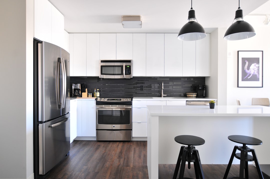
Open-concept homes are designed to feel spacious, connected, and filled with natural light. Kitchens flow into dining areas, dining spaces connect with living rooms, and hallways or entryways may remain visible from several parts of the main floor.
This layout is popular throughout Kanata and Riverside South, but it creates a unique challenge when it is time to repaint.
In a traditional home with clearly separated rooms, homeowners can choose individual colors for each space with relatively little concern about how they interact. In an open-concept home, several walls, finishes, and functional areas can be visible at the same time. A color decision made for the kitchen can therefore affect how the living room looks, while flooring, cabinetry, countertops, furniture, and natural light all influence the overall result.
That is why successful open-concept interior painting requires more than choosing one attractive paint color.
The objective is to create visual continuity while still giving each area enough definition to feel intentional.
Professional interior painting can help refresh an open-concept home without changing its layout or undertaking a major renovation. With the right colors, finishes, preparation, and transitions, homeowners can make an existing space feel brighter, cleaner, more modern, and more cohesive.
Low Mountain Painting provides professional interior painting services throughout Kanata, Riverside South, Barrhaven, Stittsville, Manotick, Greely, and surrounding Ottawa communities, helping homeowners create coordinated interiors that work naturally with their homes.
Why Open-Concept Homes Require a Different Painting Strategy
Open-concept layouts remove many of the walls and doorways that traditionally separate rooms.
That means homeowners may be able to see the:
- Kitchen
- Dining area
- Living room
- Entryway
- Staircase
- Hallway
from a single position.
Every color does not need to be identical, but the colors need to communicate with one another.
If the kitchen is painted a cool grey, the dining area a yellow beige, and the living room a strongly saturated blue, the entire main floor can feel visually fragmented.
A successful palette creates relationships between these areas.
Start With the Entire Main Floor, Not One Wall
One of the biggest mistakes when painting an open-concept home is choosing colors room by room.
Instead, step back and evaluate the entire connected area.
Identify:
- Flooring
- Kitchen cabinets
- Countertops
- Backsplash
- Fireplace
- Staircase
- Trim
- Interior doors
- Large furniture
- Natural light
These elements form the foundation of the color scheme.
Paint should help connect them.
Permanent Finishes Should Guide the Palette
Paint is relatively easy to change compared with flooring, cabinetry, countertops, or stone.
For that reason, homeowners should generally build their paint palette around the permanent materials already in the home.
Consider a main floor with:
- Natural oak flooring
- Warm white cabinets
- White quartz countertops
- Black hardware
- A stone fireplace
A warm white, balanced greige, soft taupe, or muted natural color may connect these elements much more successfully than an unrelated cool grey.
The best wall color is not simply the most attractive color on a sample card.
It is the color that works best with the home.
Understand Undertones Before Choosing Paint
Undertones become especially important in open spaces because so many materials appear together.
A neutral paint may contain subtle undertones of:
- Yellow
- Green
- Pink
- Blue
- Violet
- Grey
Flooring and cabinetry have undertones too.
When these undertones conflict, something may appear wrong even when homeowners cannot immediately identify the problem.
For example, a strongly blue-grey wall can make warm oak flooring appear more orange.
A very cool white can make creamy kitchen cabinets appear yellow.
A carefully selected neutral can instead connect those finishes.
Warm White Can Create a Fresh Foundation
Warm white is one of the most versatile choices for open-concept homes.
It can make connected spaces feel:
- Bright
- Clean
- Airy
- Contemporary
- Cohesive
Unlike an extremely stark white, a subtle warm white can work beautifully with wood flooring, stone, warm cabinetry, and natural textures.
It is particularly useful when homeowners want the architecture and furnishings to provide most of the color.
Greige Can Bridge Warm and Cool Materials
Greige combines characteristics of grey and beige.
That makes it useful in homes containing a mixture of finishes.
A carefully chosen greige may coordinate with:
- Wood flooring
- White cabinetry
- Quartz
- Stone
- Black fixtures
- Stainless steel appliances
The exact undertone matters, however.
Some greiges lean noticeably warm, while others contain stronger grey or green undertones.
Samples should always be evaluated inside the actual home.
Soft Taupe Adds Warmth Without Feeling Dated
Taupe can be an excellent alternative for homeowners who want something warmer than grey but more sophisticated than traditional beige.
Light taupe can work particularly well in:
- Living rooms
- Dining areas
- Entryways
- Transitional spaces
It can also create a beautiful backdrop for wood, stone, cream upholstery, and black accents.
One Color Does Not Have to Cover the Entire Main Floor
Creating continuity does not mean every wall must be identical.
Homeowners can use a primary color throughout most of the open area and introduce secondary colors strategically.
For example:
Main walls: warm white
Dining area: soft taupe
Office or adjoining space: muted sage
Fireplace feature: deeper neutral
Trim: coordinated white
The colors remain related while individual areas gain personality.
Use Architectural Breaks for Color Changes
Where should one paint color stop and another begin?
This is an important question in open-concept homes.
The cleanest transitions usually occur at natural architectural boundaries, such as:
- Inside corners
- Doorways
- Columns
- Bulkheads
- Changes in ceiling height
- Recessed areas
Changing color in the middle of a continuous wall can look arbitrary.
Professional planning helps identify transitions that appear intentional.
Use Color to Define Functional Zones
An open-concept floor plan may physically connect several spaces, but those spaces still serve different purposes.
Paint can subtly define them.
A dining area might use a slightly deeper version of the main neutral.
A fireplace wall might carry a muted accent.
An entryway could use a complementary shade that visually separates it from the living room.
The difference does not need to be dramatic.
Small variations can provide enough definition.
Refresh the Kitchen Without Replacing Everything
The kitchen is often the visual centre of an open-concept main floor.
If the cabinetry and countertops are still in good condition, changing the surrounding paint can dramatically alter how the entire kitchen feels.
Fresh wall paint can help older finishes appear:
- Cleaner
- More intentional
- Better coordinated
- More contemporary
This can be especially effective when the existing wall color is making cabinetry or flooring look dated.
Coordinate Paint With Kitchen Cabinets
Cabinet color should be considered before choosing surrounding wall paint.
White Cabinets
White cabinetry can pair with:
- Warm white
- Greige
- Taupe
- Muted green
- Soft blue-grey
But the cabinet white itself must be considered.
A creamy white cabinet can clash with a strongly cool wall white.
Wood Cabinets
Natural wood cabinetry often works well with:
- Warm white
- Light greige
- Soft taupe
- Muted sage
The goal is usually to complement the wood rather than match it.
Dark Cabinets
Dark cabinetry may benefit from lighter surrounding walls to prevent the kitchen from becoming visually heavy.
Flooring Connects the Entire Open Space
In many open-concept homes, one flooring material extends across several functional areas.
This makes flooring one of the most important color references.
Paint should coordinate with its undertones.
Natural oak may work beautifully with warm whites and greige.
Dark hardwood can create strong contrast with lighter walls.
Grey flooring may require careful neutral selection to avoid making the interior feel overly cold.
Because the flooring runs continuously, a compatible wall palette helps reinforce the sense of connection.
Make the Living Room Feel More Inviting
The living room should feel connected to the kitchen without appearing like an extension of it.
Paint can provide subtle separation.
If the main floor uses a light neutral, the living room might introduce personality through:
- A fireplace feature
- Built-ins
- A complementary wall color
- Deeper furnishings
The wall palette should remain calm enough to work with the kitchen visible nearby.
Use the Fireplace as a Natural Focal Point
Many open-concept homes contain a fireplace visible from multiple areas.
Instead of introducing a random accent wall, homeowners can use the fireplace as the logical focal point.
Depending on the surrounding materials, suitable colors might include:
- Charcoal
- Deep taupe
- Muted green
- Navy
- Warm off-white
The fireplace material itself should guide the selection.
Refresh the Dining Area With Subtle Contrast
Dining areas can sometimes disappear visually inside open-concept layouts.
A carefully chosen paint treatment can give the area more presence.
Options include:
- A slightly deeper neutral
- Muted green
- Sophisticated blue
- Warm taupe
The color should remain connected to the main palette.
Consider the Entryway
The entryway establishes the first impression of the interior.
In an open-concept home, visitors may immediately see the kitchen, living room, and staircase from the front door.
A coordinated entryway color helps make the entire main floor appear planned rather than pieced together.
Durability is also important because entryways experience frequent contact and dirt.
Hallways Should Support the Main Palette
Hallways function as visual connectors.
A versatile neutral often works best because it allows adjoining rooms to carry more personality.
Warm white, greige, and soft taupe are common choices.
Using the same hallway neutral throughout the home can also improve continuity between floors.
Don’t Forget the Staircase
Open staircases are prominent features in many Kanata and Riverside South homes.
Painting can refresh:
- Stairwell walls
- Trim
- Railings
- Newel posts
- Risers where appropriate
Updating these surfaces alongside the main floor can make the renovation feel much more complete.
Ceilings Influence the Entire Space
Large open-concept areas can have extensive uninterrupted ceilings.
If the walls are freshly painted but the ceiling remains dull, yellowed, or visibly patched, the difference can become more noticeable.
Fresh ceiling paint can:
- Improve perceived brightness
- Create a cleaner appearance
- Reduce visible inconsistencies
- Complete the renovation
Should Ceilings Always Be Bright White?
Not necessarily.
White remains a practical and popular choice, but the ceiling color should coordinate with the wall and trim palette.
In certain designs, a softer white can feel more cohesive than a stark blue-white.
Some spaces can even support color on the ceiling, although this requires careful planning.
Trim Helps Unify Open-Concept Interiors
Baseboards, window trim, door frames, and crown moulding create lines throughout the home.
Using a consistent trim color is one of the easiest ways to create visual continuity.
Fresh trim paint can also make older walls and architectural details appear significantly cleaner.
Interior Doors Can Become Part of the Design
White doors remain popular, but homeowners are increasingly using interior doors as design elements.
Possible options include:
- Warm white
- Greige
- Taupe
- Charcoal
Darker doors can provide sophisticated contrast in the right home.
However, consistency matters when several doors are visible simultaneously.
Natural Light Changes Everything
Open-concept homes often have windows on multiple sides.
This means the same wall color can look different from one end of the room to the other.
A neutral may appear warmer near one window and cooler near another.
Paint samples should therefore be observed:
- In the morning
- At midday
- In the afternoon
- After sunset
This provides a much better understanding of how the color will behave.
Artificial Lighting Matters After Sunset
Ottawa homes spend many winter hours relying on artificial light.
Warm LEDs can emphasize beige or yellow undertones.
Cooler lighting can emphasize blue and grey.
Paint should be evaluated under the lighting homeowners actually use.
Test Large Paint Samples
Tiny paint chips can hide important undertones.
Larger samples provide a more realistic impression.
Samples should be viewed beside:
- Flooring
- Cabinets
- Countertops
- Trim
- Fireplace materials
They should also be moved to different parts of the open area.
Use Accent Colors Carefully
Accent colors can work beautifully in open layouts when they have a reason to exist.
Good locations include:
- Fireplace walls
- Dining areas
- Built-ins
- Architectural recesses
Random accent walls can interrupt visual flow.
The accent should contribute to the overall palette rather than compete with it.
Muted Green Works Well With Natural Materials
Sage and other muted greens can work particularly well with:
- Oak
- Warm white
- Stone
- Black fixtures
- Natural textiles
This makes green a useful accent for homeowners who want more color without overwhelming an open floor plan.
Deeper Colors Can Add Sophistication
Open-concept homes do not need to be entirely pale.
Deep colors can provide balance when used strategically.
Options may include:
- Deep olive
- Navy
- Charcoal
- Rich taupe
- Muted blue
These colors can define architectural features while lighter neutrals maintain openness elsewhere.
Avoid Too Many Competing Colors
A connected floor plan already contains many visual elements.
Cabinetry, flooring, furniture, artwork, appliances, countertops, and fixtures all contribute color.
Adding too many wall colors can create visual noise.
A restrained palette often produces a more sophisticated result.
Consider a Three-Color Strategy
One practical approach is to build the main floor around three related colors.
For example:
Primary neutral: warm white
Secondary color: light greige
Accent: muted sage
Another option might be:
Primary neutral: pale taupe
Secondary: cream
Accent: deep blue
The specific combination depends on the permanent finishes.
Refresh Builder-Grade Interiors With Paint
Many newer homes begin with simple builder-selected colors designed for broad appeal.
These colors may be practical but not particularly personal.
Professional interior painting allows homeowners to introduce:
- Warmth
- Personality
- Better contrast
- More sophisticated undertones
without altering the home’s architecture.
Painting Can Modernize an Older Open-Concept Renovation
Open-concept renovations completed years ago may still have outdated color schemes.
Examples include:
- Cool grey throughout
- Yellow beige
- Strong brown
- High-contrast feature walls
Updating the palette can make the entire renovation feel current again without replacing the kitchen or flooring.
Choose Paint Finish Based on Function
Color is only part of the decision.
Different areas experience different levels of traffic.
Living Areas
Matte or eggshell can provide a refined appearance depending on the product.
Kitchens and Dining Areas
Durable, washable coatings are useful where walls may need more frequent cleaning.
Hallways and Entryways
Washable finishes can help manage scuffs and contact.
Trim and Doors
Satin or semi-gloss finishes are commonly selected for additional durability.
Product choice should always match the specific surface and maintenance requirements.
Surface Preparation Makes the Refresh Look Professional
Changing color cannot hide every wall problem.
Open-concept homes may contain:
- Nail holes
- Furniture damage
- Settlement cracks
- Previous patches
- Scuffing
- Failed caulking
- Uneven touch-ups
Professional preparation may include:
- Cleaning
- Filling
- Sanding
- Repairing
- Caulking where appropriate
- Spot priming
The smoother the underlying surface, the cleaner the final result.
Low-VOC Paint Is Worth Considering
Because open-concept painting may involve a large portion of the occupied home, homeowners may prefer low-VOC products.
Modern low-VOC paints are available in numerous colors, sheens, and performance levels.
They can be particularly useful for:
- Families
- Home offices
- Large interior projects
- Occupied homes
Plan the Painting Sequence Carefully
Open-concept projects require organization because several spaces are connected.
A professional sequence may involve:
- Protecting flooring and furniture
- Completing repairs
- Preparing ceilings
- Painting ceilings
- Painting walls
- Finishing trim
- Painting doors where included
- Completing touch-ups
- Final inspection
Proper sequencing helps create cleaner transitions and reduces unnecessary rework.
Open-Concept Interior Painting in Kanata
Kanata contains a broad mix of established and newer homes, including many properties with connected kitchens, dining spaces, and family rooms.
Professional interior painting can help Kanata homeowners:
- Update builder colors
- Modernize older palettes
- Coordinate flooring and cabinetry
- Refresh high-traffic areas
- Create better main-floor flow
The objective is to make the entire connected space feel intentional.
Open-Concept Interior Painting in Riverside South
Riverside South has many modern family homes where open layouts play a major role in everyday living.
Painting can personalize these spaces without requiring major construction.
Homeowners can use a coordinated palette to connect:
- Kitchen cabinetry
- Dining spaces
- Living rooms
- Staircases
- Entryways
while still giving individual zones their own identity.
Common Open-Concept Painting Mistakes
Choosing Each Area Independently
Colors may look good individually but clash when viewed together.
Ignoring Flooring
Continuous flooring strongly influences the entire palette.
Using Too Many Accent Walls
Multiple competing focal points can make the layout feel busy.
Choosing White Without Checking Undertones
Different whites can clash with cabinets and trim.
Ignoring the Ceiling
A dated ceiling can make freshly painted walls feel incomplete.
Skipping Surface Preparation
New color cannot hide damaged or poorly repaired walls.
Choosing From a Small Paint Chip
Undertones become much more noticeable across large wall surfaces.
Can Painting Make an Open-Concept Home Feel Larger?
It can influence how spacious the home feels.
A coordinated palette reduces visual interruption between connected areas.
Lighter colors can also help distribute available light and reduce strong visual boundaries.
However, homeowners do not need to use white everywhere.
Consistency and balance are often more important than simply choosing the lightest possible color.
Can Painting Make a Large Open Space Feel Cozier?
Yes.
Some open-concept homes feel too expansive or undefined.
Warmer neutrals, deeper accents, and strategic color zoning can introduce greater intimacy without constructing new walls.
Dining areas and fireplace zones are particularly useful places for slightly richer colors.
Painting Before Selling an Open-Concept Home
Open-concept layouts are designed to showcase space and flow.
A disconnected color palette can work against that advantage.
Before listing a home, coordinated interior painting can help create:
- Cleaner presentation
- Better visual continuity
- Brighter photographs
- A more move-in-ready appearance
Neutral does not have to mean boring. A carefully selected warm neutral can create an attractive backdrop for flooring, cabinetry, furniture, and architectural features.
When Is It Time to Repaint?
Consider refreshing an open-concept interior when:
- Walls are heavily scuffed
- Colors feel outdated
- Previous touch-ups are visible
- New flooring has been installed
- Cabinets have changed
- Furniture has been updated
- Rooms feel visually disconnected
- The home is being prepared for sale
A color refresh can sometimes change how homeowners perceive the entire main floor.
Why Professional Interior Painting Makes a Difference
Open-concept painting requires careful attention to transitions.
Professional painters can help manage:
- Surface preparation
- Continuous walls
- High ceilings
- Stairwells
- Trim lines
- Multiple connected spaces
- Product and finish selection
- Consistent application
Low Mountain Painting provides professional interior painting for homeowners throughout Kanata, Riverside South, Barrhaven, Stittsville, Manotick, Greely, and surrounding Ottawa communities.
Whether the goal is to refresh a newer home, modernize an older palette, or create better visual flow throughout the main floor, a professionally planned paint scheme can make a substantial difference.
Conclusion
Refreshing an open-concept home with interior painting is about much more than changing wall color.
Because kitchens, living rooms, dining spaces, entryways, hallways, and staircases often share the same visual field, every color decision affects the larger interior.
The most successful approach begins with the home’s permanent finishes. Flooring, cabinetry, countertops, fireplaces, trim, and natural light should guide the palette.
From there, homeowners can create a primary neutral, introduce complementary secondary shades, and use deeper colors selectively to define important architectural features or functional zones.
For homes in Kanata and Riverside South, professional interior painting offers a practical way to modernize an open-concept space without the expense and disruption of major remodeling.
With thoughtful color planning, proper surface preparation, appropriate paint finishes, and professional application, an existing main floor can feel brighter, more connected, more personalized, and completely refreshed.
Low Mountain Painting serves Kanata, Riverside South, Barrhaven, Stittsville, Manotick, Greely, and surrounding Ottawa areas, helping homeowners create polished interiors with colors designed to work together from one space to the next.
Frequently Asked Questions
What are the best paint colors for an open-concept home?
Warm whites, greige, soft taupe, muted beige, and other versatile neutrals are common starting points. The best choice depends on flooring, cabinetry, countertops, lighting, and other permanent finishes.
Should an entire open-concept main floor be painted the same color?
Not necessarily. One primary color can create continuity, while complementary colors can define dining areas, fireplaces, or other architectural zones.
How many paint colors should be used in an open-concept space?
There is no fixed rule, but a restrained palette is usually easier to coordinate. A primary neutral, secondary shade, and carefully selected accent can provide variety without making the space feel fragmented.
How do I choose paint that works with kitchen cabinets?
Compare wall samples directly with the cabinetry. Pay particular attention to undertones because warm and cool whites or neutrals can clash when placed side by side.
What colors make an open-concept home feel larger?
Light warm whites, pale greige, and other lighter neutrals can help create an airy appearance. Consistent color flow is also important because excessive contrast can visually divide the space.
Can dark colors work in an open-concept home?
Yes. Navy, charcoal, deep olive, taupe, and other darker shades can work beautifully when used strategically on fireplaces, architectural features, dining zones, or other selected areas.
Should the kitchen and living room be the same color?
They can be, but they do not have to be. If different colors are used, they should share compatible undertones and transition at a logical architectural boundary.
What paint finish works best for an open-concept main floor?
It depends on the surface and traffic level. Matte or eggshell may work well in living areas, while kitchens, hallways, and entryways may benefit from durable washable coatings. Trim and doors commonly use satin or semi-gloss.
Should ceilings be repainted when refreshing an open-concept home?
Often, yes. Fresh walls can make an older or yellowed ceiling more noticeable. Repainting the ceiling can create a cleaner, more complete transformation.
Can interior painting modernize builder-grade homes in Kanata and Riverside South?
Yes. Replacing generic builder colors with a carefully coordinated palette can add warmth, personality, and visual depth without requiring structural changes.
Is surface preparation necessary if the walls are already painted?
Yes. Previously painted walls can still have holes, cracks, scuffs, rough patches, or failed repairs. Proper cleaning, filling, sanding, and priming where necessary help produce a smoother professional finish.
Why hire professional interior painters for an open-concept home in Kanata or Riverside South?
Open-concept homes often involve long continuous walls, complex color transitions, stairwells, high ceilings, and several visible spaces that need to work together. Professional preparation and application can create a more consistent, polished result throughout the entire connected interior.