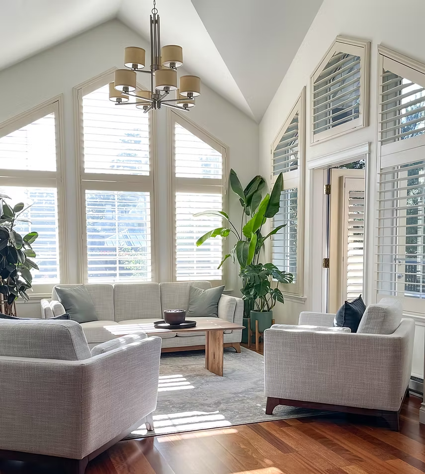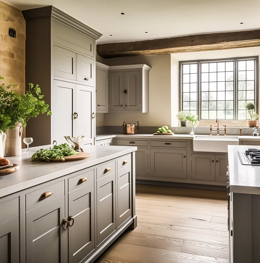
Whole-home interior painting can completely change the way a property feels, but achieving a polished result requires more than choosing a few attractive colors. When every room is visible in relation to the next, the real challenge is creating a palette that feels connected from one space to another.
For homeowners in Manotick and Riverside South, this is especially important because local homes often include a wide mix of layouts, finishes, natural light, flooring, cabinetry, architectural details, and room functions. A color that looks beautiful in one room may feel completely wrong in the next if the undertones, lighting, or permanent finishes are different.
A successful whole-home painting project should create:
- Better visual flow
- Consistent undertones
- Smooth transitions between rooms
- A cohesive relationship between flooring, cabinetry, trim, and walls
- Enough variation to prevent the home from feeling flat
The goal is not to paint every room exactly the same color.
The goal is to create a family of colors that work together naturally.
Low Mountain Painting provides professional interior painting services throughout Manotick, Riverside South, Kanata, Barrhaven, Stittsville, Greely, and surrounding Ottawa communities, helping homeowners create coordinated interior color schemes that feel intentional, balanced, and comfortable.
Why a Whole-Home Color Palette Matters
When rooms are painted independently, the home can begin to feel visually disconnected.
One room may be cool grey.
Another may be warm beige.
A hallway may be bright white.
A bedroom may use a blue with completely different undertones.
Individually, each color might be attractive.
Together, they may create a fragmented interior.
A coordinated palette improves continuity.
Start With the Home as a Whole
Before choosing any individual wall color, homeowners should evaluate the property from a broader perspective.
Consider:
- Flooring
- Kitchen cabinets
- Countertops
- Backsplashes
- Fireplace materials
- Trim
- Interior doors
- Natural wood
- Tile
- Staircases
- Built-ins
- Large furniture
These materials influence every paint decision.
Permanent Finishes Should Lead the Palette
Paint is one of the easiest interior finishes to change.
Flooring, cabinetry, stone, and countertops are much more expensive and disruptive to replace.
That means the permanent materials should generally guide the wall colors.
For example, a home with warm oak flooring and natural stone may suit:
- Warm white
- Greige
- Soft taupe
- Muted sage
better than a heavily blue-based grey.
Understand Undertones
Undertones are one of the most important parts of color planning.
A white can lean:
- Yellow
- Grey
- Blue
- Green
- Pink
A beige may lean:
- Warm yellow
- Pink
- Grey
- Green
A greige may lean warmer or cooler depending on the formula.
If wall colors and permanent finishes have conflicting undertones, the entire room can feel slightly off.
Choose a Main Neutral First
A whole-home palette usually works best when built around one primary neutral.
This color may appear in:
- Hallways
- Entryways
- Open-concept spaces
- Transitional areas
- Stairwells
Good starting points may include:
- Warm white
- Light greige
- Soft taupe
- Pale beige
This main neutral acts as the visual thread connecting the home.
Warm White as a Whole-Home Foundation
Warm white can be especially effective in homes with:
- Natural wood
- Stone
- Creamy cabinetry
- Warm flooring
It provides brightness without feeling overly stark.
Warm white also allows furniture and artwork to become more prominent.
Greige for Flexibility
Greige is often one of the easiest whole-home neutrals to use because it bridges warm and cool materials.
It can work with:
- Oak
- White cabinetry
- Quartz
- Grey tile
- Black fixtures
- Natural stone
The key is choosing the right greige undertone.
Soft Taupe for Depth
Taupe can provide more depth than white or light greige while still remaining versatile.
It works particularly well in:
- Living rooms
- Dining rooms
- Bedrooms
- Home offices
A soft taupe can make a home feel warmer and more sophisticated.
Build a Small Supporting Palette
Once the main neutral is selected, add a limited number of supporting colors.
For example:
Main neutral: warm white
Secondary neutral: light greige
Natural accent: muted sage
Deep accent: charcoal
This creates variety without visual chaos.
Avoid Using Too Many Colors
A whole-home repaint does not need a different color in every room.
Too many unrelated shades can make the interior feel smaller and less cohesive.
A restrained palette is usually easier to maintain and more visually consistent.
Let Rooms Have Personality
Consistency does not mean sameness.
Bedrooms, offices, dining rooms, and powder rooms can still have distinct personalities.
The important thing is making sure those colors relate to the overall palette.
For example:
Hallways: warm white
Living room: light greige
Office: sage green
Bedroom: muted blue
Dining room: soft taupe
These colors can feel different while still sharing compatible undertones.
Hallways Are the Connective Tissue
Hallways visually connect multiple rooms.
Because of that, they are usually best painted in a flexible neutral.
Popular options include:
- Warm white
- Pale greige
- Light taupe
Using a consistent hallway color helps create smooth transitions.
Entryways Should Set the Tone
The entryway is the first interior space guests see.
Its color should introduce the rest of the palette.
It should also coordinate with:
- Flooring
- Staircase
- Nearby living spaces
- Trim
- Front door
A well-chosen entry color makes the entire home feel more intentional.
Open-Concept Main Floors Need Extra Coordination
Many Riverside South homes feature open-concept layouts.
When the kitchen, dining room, and living room are visible at the same time, the palette needs to be especially cohesive.
One primary neutral can be used across most walls, with secondary colors reserved for:
- Dining areas
- Fireplaces
- Built-ins
- Architectural recesses
Manotick Homes May Require More Transitional Planning
Manotick homes often include:
- Natural wood
- Stone fireplaces
- Traditional trim
- Separate dining rooms
- Custom architectural details
A whole-home palette in these properties should respect the existing character while still feeling current.
Warm neutrals often work well because they connect older materials with modern furnishings.
Coordinate Paint With Flooring
Flooring is one of the strongest visual elements in any home.
Warm Hardwood
Pairs well with:
- Warm white
- Greige
- Taupe
- Muted green
Dark Hardwood
Often benefits from lighter walls.
Grey Flooring
Requires careful undertone matching.
Beige Carpet
Usually works best with warm neutrals.
Coordinate With Kitchen Cabinets
Kitchen cabinets are highly visible and often expensive to change.
White Cabinets
Compare the cabinet white directly with the wall color.
Wood Cabinets
Warm neutrals and muted greens can work beautifully.
Dark Cabinets
Lighter walls can create better balance.
Countertops Matter Too
Countertops often contain subtle undertones.
Paint should relate to those undertones rather than compete with them.
Busy granite often works best with simpler wall colors.
White quartz gives homeowners more flexibility.
Trim Should Be Consistent
One of the easiest ways to unify a whole-home paint scheme is to use a consistent trim color.
Trim includes:
- Baseboards
- Window frames
- Door frames
- Crown moulding
- Interior doors where appropriate
A coordinated trim color helps every room feel connected.
Interior Doors Can Be Part of the Palette
White doors remain popular, but whole-home painting can also include:
- Warm white
- Greige
- Taupe
- Charcoal
If darker doors are used, consistency is important.
Ceiling Color Should Be Planned
Ceilings are often ignored until the walls are finished.
However, yellowed or inconsistent ceilings can make freshly painted walls feel incomplete.
A clean ceiling color can improve:
- Brightness
- Visual consistency
- Overall finish quality
Flat paint is commonly used on ceilings because it minimizes glare.
Should Every Ceiling Be White?
Not necessarily.
White remains the most practical choice for most homes, but certain rooms may support a softer white or coordinated tone.
The ceiling color should work with:
- Wall color
- Trim
- Lighting
- Ceiling height
Lighting Changes Paint Throughout the Home
A color can look different in every room.
North-facing rooms may feel cooler.
South-facing rooms may feel warmer.
Artificial lighting also changes undertones.
That means the whole-home palette should be tested in multiple rooms.
Test Paint Samples in More Than One Location
Do not test a color in only one room and assume it will work everywhere.
A better approach is to test the same shade in:
- Hallway
- Living room
- Kitchen
- Bedroom
Observe the color at different times of day.
Artificial Lighting Matters at Night
Ottawa homes rely heavily on artificial lighting during winter.
Warm bulbs can make paint appear more yellow.
Cooler bulbs can emphasize blue and grey.
The color should look good under both daylight and evening lighting.
Use Accent Colors Carefully
Accent colors should support the whole-home palette.
Good locations include:
- Fireplace walls
- Built-ins
- Offices
- Dining rooms
- Powder rooms
Random feature walls can interrupt flow.
Sage Green as a Supporting Color
Muted sage works well with many Ottawa interiors because it pairs beautifully with:
- Wood
- Stone
- Warm white
- Black accents
- Beige flooring
It can be used in bedrooms, offices, or dining rooms while still fitting into a neutral whole-home scheme.
Muted Blue Can Add Calm
Soft blue or blue-grey can work well in:
- Bedrooms
- Bathrooms
- Offices
The tone should coordinate with the main neutral.
Charcoal and Deep Colors Add Contrast
Deeper shades can be used selectively on:
- Fireplaces
- Built-ins
- Offices
- Dining rooms
- Interior doors
They add depth without overwhelming the entire home.
Whole-Home Painting Can Make a Home Feel Larger
Using coordinated colors reduces visual interruption.
When rooms flow naturally from one to another, the home can feel more spacious.
This is particularly helpful in:
- Hallways
- Open-concept homes
- Smaller rooms
- Connected main floors
Whole-Home Painting Can Also Make Large Homes Feel More Connected
Larger homes can sometimes feel disjointed when every room uses unrelated colors.
A consistent palette creates continuity and makes the property feel more intentional.
Consider Room Function
Each room should still be painted according to how it is used.
Living Rooms
Need comfort and durability.
Kitchens
Need washability.
Bedrooms
Benefit from softer colors.
Bathrooms
Need moisture-appropriate coatings.
Hallways
Need durable finishes.
Children’s Rooms
Need easy maintenance.
Paint Finish Should Also Be Consistent
A whole-home project should consider finish as well as color.
Common strategies include:
Ceilings: flat
Living areas: matte or eggshell
High-traffic areas: washable eggshell or satin
Trim and doors: satin or semi-gloss
The exact product should be selected according to the room and surface.
Surface Preparation Is Essential
Whole-home painting makes inconsistencies more noticeable.
Walls may contain:
- Nail holes
- Cracks
- Old patches
- Scuffs
- Previous touch-ups
- Failed caulking
Professional preparation may include:
- Cleaning
- Filling
- Sanding
- Repairing
- Priming where necessary
Preparation helps create a consistent finish throughout the home.
Previous Color Changes May Need Primer
Rooms with very dark or saturated paint may require additional preparation.
Primer may help create more uniform coverage when changing to a lighter palette.
The correct approach depends on the existing surface and selected product.
Low-VOC Paint Can Be Useful for Whole-Home Projects
Large interior projects may affect many occupied rooms at once.
Low-VOC paint can help reduce paint-related emissions and strong odors.
Modern low-VOC products are available in durable formulas for most interior spaces.
Whole-Home Painting Before Moving In
One of the easiest times to repaint an entire home is before furniture is moved in.
Benefits include:
- Easier access
- Less furniture protection
- Faster room-to-room progress
- Cleaner scheduling
New homeowners in Manotick and Riverside South often use this opportunity to replace builder colors or previous-owner palettes.
Whole-Home Painting Before Selling
A coordinated color scheme can also help when preparing for resale.
Fresh paint can create:
- Better visual flow
- Cleaner listing photographs
- Broader buyer appeal
- More consistent presentation
Neutral does not need to mean plain.
A sophisticated warm palette can make the home feel move-in ready.
Whole-Home Painting After Renovations
Painting can help tie together renovations completed at different times.
For example:
- New flooring
- Updated kitchen
- New trim
- Bathroom renovation
may all feel disconnected until a consistent paint palette is introduced.
Common Whole-Home Color Mistakes
Choosing Every Room Independently
The colors may clash when viewed together.
Using Too Many Neutrals
Even neutrals can conflict if their undertones are different.
Ignoring Flooring
Paint should coordinate with the home’s largest permanent surfaces.
Choosing Whites Without Comparing Them
Different whites can clash dramatically.
Forgetting Trim and Doors
These surfaces appear throughout the entire home.
Using Trends Without Considering the Architecture
The palette should work with the home itself.
Why Professional Color Planning Helps
Whole-home interior painting requires more coordination than a single-room project.
Professional painters can help homeowners evaluate:
- Undertones
- Lighting
- Flooring
- Cabinetry
- Room flow
- Surface condition
- Sheen
- Product performance
This helps reduce costly color mistakes.
Whole-Home Interior Painting in Manotick
Manotick homes often contain distinctive materials and architectural details.
A professional palette can help modernize the home while preserving:
- Natural wood
- Stone
- Traditional trim
- Fireplaces
- Custom built-ins
The objective should be balance rather than removing character.
Whole-Home Interior Painting in Riverside South
Riverside South homes often feature:
- Modern layouts
- Open-concept main floors
- White cabinetry
- Contemporary flooring
- Large connected spaces
A coordinated palette can personalize these homes while maintaining their clean modern design.
A Sample Whole-Home Palette
A practical example might include:
Entryway: warm white
Hallways: warm white
Living room: light greige
Kitchen: warm white
Dining room: soft taupe
Office: muted sage
Primary bedroom: pale blue-grey
Bathrooms: coordinated light neutral
Trim: consistent warm white
The exact colors should always be tested in the home.
A Second Palette for Warmer Interiors
Another option:
Main neutral: creamy off-white
Secondary: light taupe
Accent: muted olive
Deep accent: charcoal
Trim: soft white
This can work particularly well with natural wood and stone.
Keep the Palette Flexible
A successful whole-home palette should work with changing:
- Furniture
- Artwork
- Rugs
- Seasonal décor
Paint should provide a stable backdrop rather than forcing future decorating decisions.
Why Professional Application Matters
Whole-home painting involves:
- Multiple rooms
- Long continuous walls
- Stairwells
- Ceilings
- Trim
- Doors
- Complex transitions
Professional application helps maintain consistency from one area to the next.
Low Mountain Painting provides professional interior painting services throughout Manotick, Riverside South, Kanata, Barrhaven, Stittsville, Greely, and surrounding Ottawa communities, helping homeowners create coordinated spaces with careful preparation and clean, consistent finishes.
Conclusion
Creating a consistent whole-home color palette is one of the most effective ways to make an interior feel more cohesive, polished, and intentional.
For homeowners in Manotick and Riverside South, the best results begin by looking beyond individual rooms.
Flooring, cabinetry, countertops, trim, natural wood, stone, lighting, and architecture should all influence the palette.
A successful approach usually includes:
- One primary neutral
- A small number of supporting colors
- A consistent trim color
- Thoughtful accent shades
- Compatible undertones
- Room-appropriate finishes
The objective is not to make every room identical.
It is to make every room feel like it belongs to the same home.
Professional surface preparation and consistent application then bring the palette together.
Low Mountain Painting serves Manotick, Riverside South, Kanata, Barrhaven, Stittsville, Greely, and surrounding Ottawa communities, helping homeowners create whole-home interiors that feel connected, modern, and carefully designed.
Frequently Asked Questions
How many paint colors should be used throughout a whole home?
There is no fixed number, but a restrained palette usually works best. One main neutral with a few complementary colors can create variety without making the interior feel disconnected.
Should every hallway be the same color?
Using a consistent hallway color can help connect different rooms and improve whole-home flow.
What is the best whole-home neutral?
Warm white, light greige, soft taupe, and pale beige are common options. The best choice depends on flooring, cabinetry, trim, and lighting.
Should all trim be the same color throughout the home?
In many cases, yes. Consistent trim color is one of the easiest ways to create visual continuity.
Can bedrooms have different colors?
Yes. Bedrooms can use distinct colors as long as they share compatible undertones with the rest of the palette.
How do I coordinate paint with hardwood flooring?
Identify whether the wood has warm, cool, red, or neutral undertones and choose wall colors that complement rather than fight those tones.
Should open-concept rooms use the same color?
They can, but they do not have to. Different colors should transition at logical architectural boundaries and share compatible undertones.
Should ceilings be repainted during a whole-home project?
Often, yes. Freshly painted walls can make older or yellowed ceilings more noticeable. Repainting ceilings can create a cleaner, more complete finish.
Is low-VOC paint suitable for whole-home painting?
Yes. Many modern low-VOC products provide excellent durability and coverage while reducing paint-related emissions.
Why hire professional painters for a whole-home project in Manotick or Riverside South?
Whole-home painting requires coordinated color planning, consistent surface preparation, careful transitions, and uniform application across many rooms. Professional painting can help create a more polished, cohesive result throughout the entire property.